
Showing posts with label textures. Show all posts
Showing posts with label textures. Show all posts
Friday, 5 May 2017

Monday, 6 March 2017
rose garden sympathy

It's hard to see the Wink of Stella that these roses were painted with. I used SU's Rose Garden, Timeless Textures and reinkers for these cards.

Thursday, 5 January 2017
good egg

Inside this card it says, "You are a good egg!" I can't beGIN to explain how wonderful it is to FINALLY have a chicken stamp set! And it's FREEEEEE in the Saleabration catalogue RIGHT NOW, with a purchase of $60CD. And the BEST thing about this set is this wonderful realistic Polish Rooster. That's right! He's a rooster, but there HAD to be an egg on this card....
(For those of you who know about these wonderful Polish guys, the designer of this stamp set obviously knew they cocked their heads to the side and she made this roo to do EXACTLY the right thing!)
Saturday, 3 December 2016
watercolor peonies

Water coloring is so...so......so NEAT! SPECIAL! I don't know HOW to say it I guess! Water color has a mystique to it that other techniques don't. OK! I know that's just MY take on it, but since this is my spot to air my opinions, that's what you'll get! I used my aqua painter and re-inkers dropped onto a clear block as my palette. That's right! A clear block makes the perfect palette! It's washable and smooth enough to mix colors to perfection.


Thursday, 6 October 2016
hello sunshine
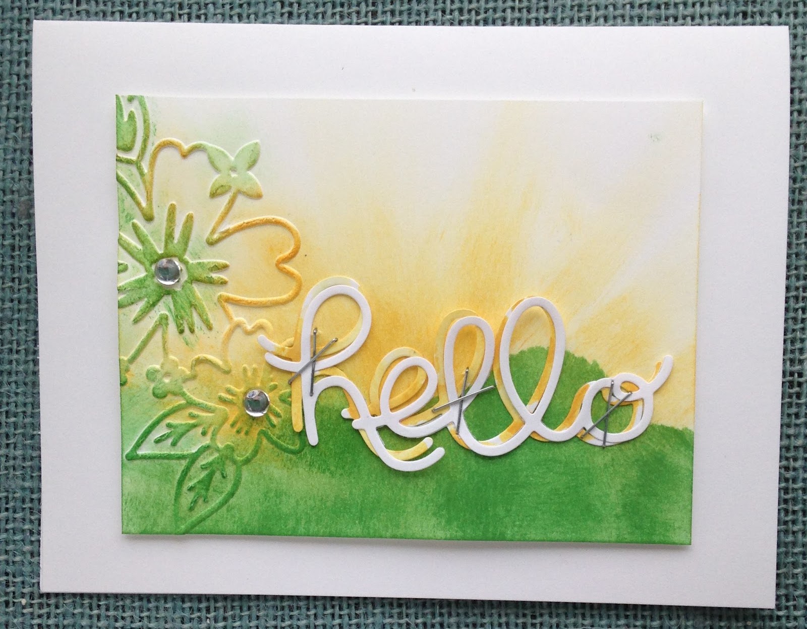
While not my usual color choice, I was happy with how this card turned out. After all, a cheerful Hello needs to be happy colors! Nothing muted, oh no!
Tuesday, 19 July 2016
my shoulder is yours


Saturday, 27 February 2016
masculine in water color

Both of these cards showcase a water colored focal point. Above, I used the elk image from The Wilderness Awaits. Below, I used Lovely As A Tree. The woodlands embossing folder (which will be available once again in the new upcoming annual catalogue) added texture to both cards, one by creating an entire background and the other by cutting out a few of the trees to layer over the image.

Wednesday, 6 January 2016
Remarkable You card set

I simply LOVE the images from the Remarkable You set. They color in so beautifully. The background on these cards was done using my brayer and some old "found" textured paper in some old stack somewhere from long ago prehistorically. Well, pre-Stampin' Upically anyway. So no, that design isn't any special technique or stamp. Sorry! I'm missing one of the Remarkable You images since I gave that card away before I got its picture taken.


Monday, 30 November 2015
elegant textures for Christmas

If you ask me what my favorite Holiday color combination is I'd tell you to look no farther than this post. Here it is. All laid out for you. Gold, cream, tan. That sorta thing. And then add all the texture you possibly can. By the way, Spellbinders has some absolutely stunning dies out there these days and I've used several of them on these cards as well as SU's sleigh ride thinlits.


Saturday, 7 November 2015
sisal "paper" textured Christmas cards

I went to the local craft store and found this creamy jute-like textured STUFF!! Hardly paper, but so neat to mat my focal point on. Something reminiscent of straw. And I'm quite sure it's suitable for a nativity scene since Baby Jesus surely laid on straw in the manger, don't you think? This image (top) is from SU's "All Ye Faithful" stamp set.

Here I used a sentiment from "Wonderland" as well as the pine branch from last year's "Ornamental Pines" set. THAT is one set SU could gladly bring back. I hear so many people who wish for it again. Especially this very universal pine and cone image. Love that straw here as well.

It's all about textures, and who doesn't love textures?
Subscribe to:
Posts
(
Atom
)