Saturday 27 February 2016

ombre botanicals


The brayer came in handy with this ombre design. It's fairly simple and straight forward. I left off the sentiment so I could quick add it when I know what occasion I will use it for.

wedding rose


In between my other card designs I find myself often reverting back to my favorite Rose Garden Thinlits dies. Here's a quick and clean and simple card created by layering pink and white roses and adding vellum leaves. So easy. So effortless. So VERY elegant!!!

happy birthday leaf in water color


By now you've figured out I LOVE WATER COLOR! Those aqua painters of mine are starting to show a lot of wear! I wish I could give you the EXACT instructions how to mimic my leaf here, but truly, I hardly know myself how I did it. Trial and error and lot of layers of water and ink markers and drying in between. Or not! I used the leaf image from Botanical Gardens, that much I do know and can tell you!

masculine in water color


Both of these cards showcase a water colored focal point. Above, I used the elk image from The Wilderness Awaits. Below, I used Lovely As A Tree. The woodlands embossing folder (which will be available once again in the new upcoming annual catalogue) added texture to both cards, one by creating an entire background and the other by cutting out a few of the trees to layer over the image.


ice cream anyone?


Sprinkles of Life is a fun fun fun stamp set with coordinating punch that I don't use nearly often enough. Here's a really simple and quick card made from Sprinkles. You could dress it up with string or ribbon or buttons or candy dots or ANYTHING!! I left it clean and simple today.

moon lake in watercolor


No matter how much I try to use DSP I always fall back on the solid color cardstock for matting my water color designs. Tell me what's wrong with me! I gave it an honest try on both of these cards, putting Designer Series Paper behind my viny cutout layer, but it simply refused to come together until I popped a simple solid color back there. The DSP made it too busy somehow. I'm sure any of YOU could have done it and turned out a gorgeous card, but me?? Ah, no!!!

I didn't put a sentiment onto these cards just yet since I didn't know what occasion they were to be used for. They would fit anything from birthday to Mother's Day and even sympathy...for sure the one below looks restful enough for sympathy. Or friendship. Or anything!!


Monday 15 February 2016

watercolor florals


You know how every now and then you hit upon a genius inspiration and your cards turn out EXACTLY LIKE YOU PICTURED! Well, the card (above) is just such a card. The two below are versions of the original plan. It all happened because I finally decided I MUST have the squares thinlets dies for frames for watercolor prints. Wow! Why didn't I get them sooner? While you can easily copy what I did here, I do have a few extra ideas or tips to acquire just this look.
~I pulled out my trusty Husqvarna sewing machine to stitch through my frame. I'm leaving my machine out now because if I put it away I'll forget what a nice touch those threads give to many different designs.
~Try Basic Gray ink to stamp your image. I love how soft the end result is especially with watercolored designs. Black sometimes is too bold for the soft edges that watercoloring creates.
~Stampin' Up's aqua painters are a must-have for this technique.
~Don't be afraid to stick to all-whites when matting your watercolor images. So clean and fresh.


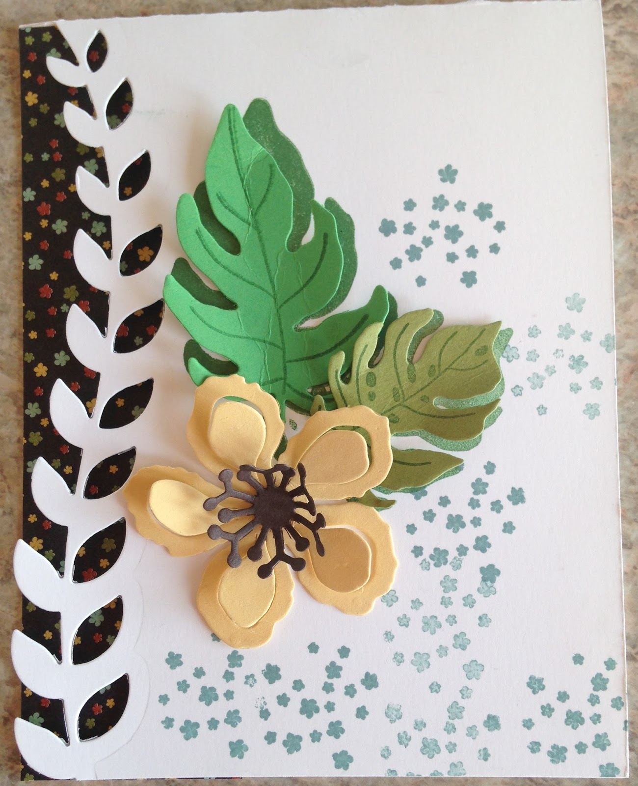
And the card below is a watercolored image that I used black ink for the outline stamp. It should be fairly easy to CASE by just looking at the picture.

Saturday 13 February 2016

emboss resist celebrations


At first it may be a tad difficult what these two cards have in common, but I stamped, embossed, and inked both of them at the same time. The balloon card was sponged while the leaf card was "aqua-paintered"! (Don't you love my new word?) And one little tip I TRY to remember when doing cards like these is to take a darker marker (WOW! Rhymes!) and outline one side and underneath each image to create a shadow effect. If it shows up, it's nice to outline the opposite sides and top with white gel pen to create a light effect.


Thursday 4 February 2016

Balloon Celebration


Happy Birthday to you!!! My 5-year-old friend and I sat down with the balloon punch and stamp bundle and made ourselves a cute little birthday card for some lucky person! This card isn't really designed for any particular age or male or female. It's actually quite versatile.

I love the fact that this bundle can be kept simple or you can get elaborate with your designs. It's quite very extremely child friendly!

celebration window


I recently got my Circle Thinlets Dies and I can't figure out how I existed before them. This card showcases a hostess set, Best Thoughts. I also tried some hand-drawn circles as well, using die cut circles as my guide. This one came together simply and quickly once the water color part was done.

dandelion wishes


If you notice in the Balloon Celebration stamp set, there are two teeny little stamps that you can use to build yourself a dandelion. They've given you a gorgeous example in the catalogue as well. The dandelion on the card above is embossed and then sponged over. I added a sentiment and different designs to finish it off. And then shadowed the edges of the dandelion with Night of Navy.

Dragonfly Birthday


At my Open House last Saturday we started with this card (above). It's simply emboss resist using sponges and different greens and blues meanwhile masking with a few different sizes of circles to create a sort of ripple affect in the water.  Below we stepped up the design by adding Garden Green ferns (from Butterfly Basics---YES!!!) and sponging a bit of pink in the water. I like both. While the cards below are more lush, the top one is soft and sweet. Everyone did a WONDERFUL job of their cards and they each turned out differently, which is what I love about this style of card.
Don't forget to outline the shadowed edges of the wings with a darker shade of turquoise to give your dragonfly a bit of depth.


know what I love?


YOU!!! I embossed the flowers from You've Got This in gold and the sentiment from What I Love in Pool Party. The hearts are punched out of Pool Party and sponged with Espresso. I sponged the edges of the card front.
And that's all, folks!!

starfish emboss resist


Both of these cards use the starfish image from Picture Perfect from the Occasions Catty. My {generic brand} embossing gun chose to quit on me so I used the TOASTER to emboss these cool leeetle starfish! Fortunately my friend Linda had an extra SU gun she sold to me so I was able to emboss again right away! (Thank-you Linda!!)

One tip here: Did you know the new stamp pad inks work to emboss with? They dry a lot quicker than Versamark so you do have to move quickly, but yes, I used the regular Espresso and I-forget-which-tan as my embossing inks on my fishy.

These cards don't differ a lot from each other, just a few elements changed out.


Any of you who want to order now during Sale-a-bration, now's the time! Let me know what I can get for you!!

More Botanical Blooms in browns


These are pretty self-explanatory. A few more Botanical Blooms examples for you!

Botanical Blooms and DSP


For all of you who know I seldom use DSP (aka designer series paper) you may be surprised at these cards in this post. My little challenge to myself was simply "Use that paper, girl!" And so I present you with DSP!!! I still have stress knowing how to use some of it, but maybe my handicap will disappear as I continue doing as I did here. We also used these cards as our make-and-take at my last Open House.

I'm so enthused about these Botanical dies, though. That leafy viney thing is the Perfect Edging for any sort of card. Here, the DSP behind it makes it really show up.


in which we celebrate basic gray and more new stuff!


I know grays are "in". But I've never gotten myself to love gray. It is so, um, GRAY!!! Sorry to all of you who adore "GRAY"!!! I can't wait till the fad is over. But meanwhile....MEANWHILE....here are a few samples of "GRAY" cards I am actually quite proud to show you! I've also managed to use the Bloomin' Hearts die in a way totally unrelated to love and Valentine's and love and hearts and love! (Can you tell I'm also not a fan of Valentines? And I agree that it makes NO SENSE, but that's how it is!)
This card (above and directly below) uses dies from the Circles, Bloomin' Hearts, and Rose Garden I believe. The circle cut-out peeks into the middle of the card. And I LOVE it!! Gray and all!!


I've seen quite a few different versions of the card (below) with the long stemmed flowers. I've only seen it on Kraft and browns so I figured I'd try GRAY!!! It turned out rather pretty, huh? Maybe I'm starting to see a bit of potential in GRAAAAAAYYYYY!!!!!