
Saturday, 31 January 2015
ferns and red tulips {effortless}
it's in the details {effortless}


What I wanted to show you is that you can change up any of the details on any card to create a completely different effect every time. I kept my colors all the same, but changed up ribbons, embellishments, frame shapes and stamped images.
Not difficult at all!
Friday, 30 January 2015
[tutorial] the Challenge Spark---northern lights technique

Tara challenged Jane and me to create a design with the "northern lights technique" as our Challenge Spark this week. (WOW, Tara, was this EVER a challenge!) What I found is that you actually have to THINK and PLAN AHEAD on this one! And as you follow my tutorial you will see my brain had a few glitches! Oh well, you will also see how it's possible to cover up mistakes!
YES! I made you a very amateur tutorial this time! Bear with the poorly lit photographs; hopefully in a few days we'll be able to fix that ongoing problem. I just couldn't wait for better pictures; had to do this RIGHT NOW! And I think you'll be able to follow my thought-pattern on here even if it's shady!
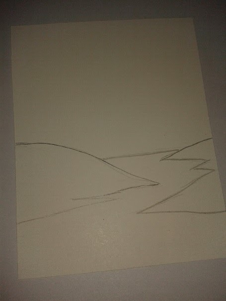

I cut out my hills to use as a mask.

Using a little bit of adhesive (mistake number one! Next time use, um, something less permanent maybe???!!! Still thinking on that one!) I adhered my hills onto another 4 1/4" by 5 1/2" piece of whisper white cardstock, making sure to place it exactly where I'd had it in my sketch.

Since I wanted my northern lights to kinda splay outward from a central spot I began my sponging in that general shape, making sure the reflection in the river was similar. I started with So Saffron.

...then added Pear Pizzazz along one side of each yellow stripe.

With Rich Razzleberry I filled in most of the white space. By now I could see my northern lights were turning into a v-shape, a bit more than I'd hoped, but I continued...

...filling in the white with Not Quite Navy, defining the night sky a bit more.

I finished off my night sky with heavily sponging in the Night of Navy, making sure to shadow it deeply beneath the hills.
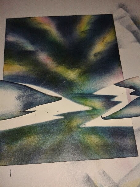
Now to unmask the hills. And here's where I GASPED! If you look closely, you'll see where the left-hand hill tore a layer right through the sky. But I'd come too far to start over. Experience has taught me I can "fix" mistakes. So to continue...

I used the other part of my mask to cover up my northern lights and I just held this piece in place since I had to move it ever so slightly as I sponged on the black ink. I wanted to cover up all the white that was left. Then I unmasked it and beheld my beautiful river and hills.

(UGH, that tear! But we WILL fix it up yet!) Taking my uni-ball Signo gel pen I highlighted the hills where in theory the light might reflect a bit. I got it too white, so with my inky fingers I smudged it up a bit. You can't see that part too well, but you're following my thought process, right?! I also used that same pen to stripe in the ripples in the river.

A small piece of torn black cardstock covered most of our original tear! See? Simple! I'm so glad I didn't trash it back then when I GASPED!!! I used that spot as the place for my "thinking of you" stamp. I used pearls to finish it off; rhinestones would have been better as they are more watery if you know what I mean. But I'm out of rhinestones and the next batch is on the UPS truck even as we speak!
Anyway, like I said, these northern lights are a bit too organized for my taste, but for a first, I'm not so disappointed. Next time I'll try and streak them across the sky a little more.
And I'll TRY to not tear my paper!
And for NEXT WEEK'S Challenge Spark: something all-white or all-white with one tiny burst of color.
And for NEXT WEEK'S Challenge Spark: something all-white or all-white with one tiny burst of color.
Tuesday, 27 January 2015
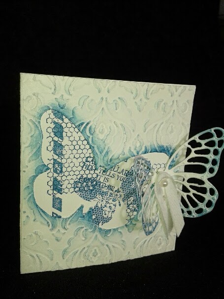
{effortless} butterfly basics collage

I've put this card in the {effortless} category and it really is effortless IF you have that gorgeous butterfly basics bundle which, in my opinion, is a necessity!
I first used my Hexagon Hive die and used it as a mask and sponged a random pattern in Hello Honey. Then I layered on the rest of the designs by stamping a variety of the Butterfly Basics.
Although you can't see it on this card, I stamped on the ferns and sentiment in Garden Green, and clear embossed it. DID you know you can use the new classic ink pads as embossing ink? If you work fairly fast, that is! It does dry quicker than Versamark, but these new spongy juicy stamp pads really do work to emboss with!
(Let me know if you want to order the Butterfly Basics Bundle. Until March 31st you qualify for a free sale-abration product for every $60 you spend before shipping and taxes! Contact me if there's anything I can get for you!)
{effortless} punchout hearts

{effortless} negative space hearts
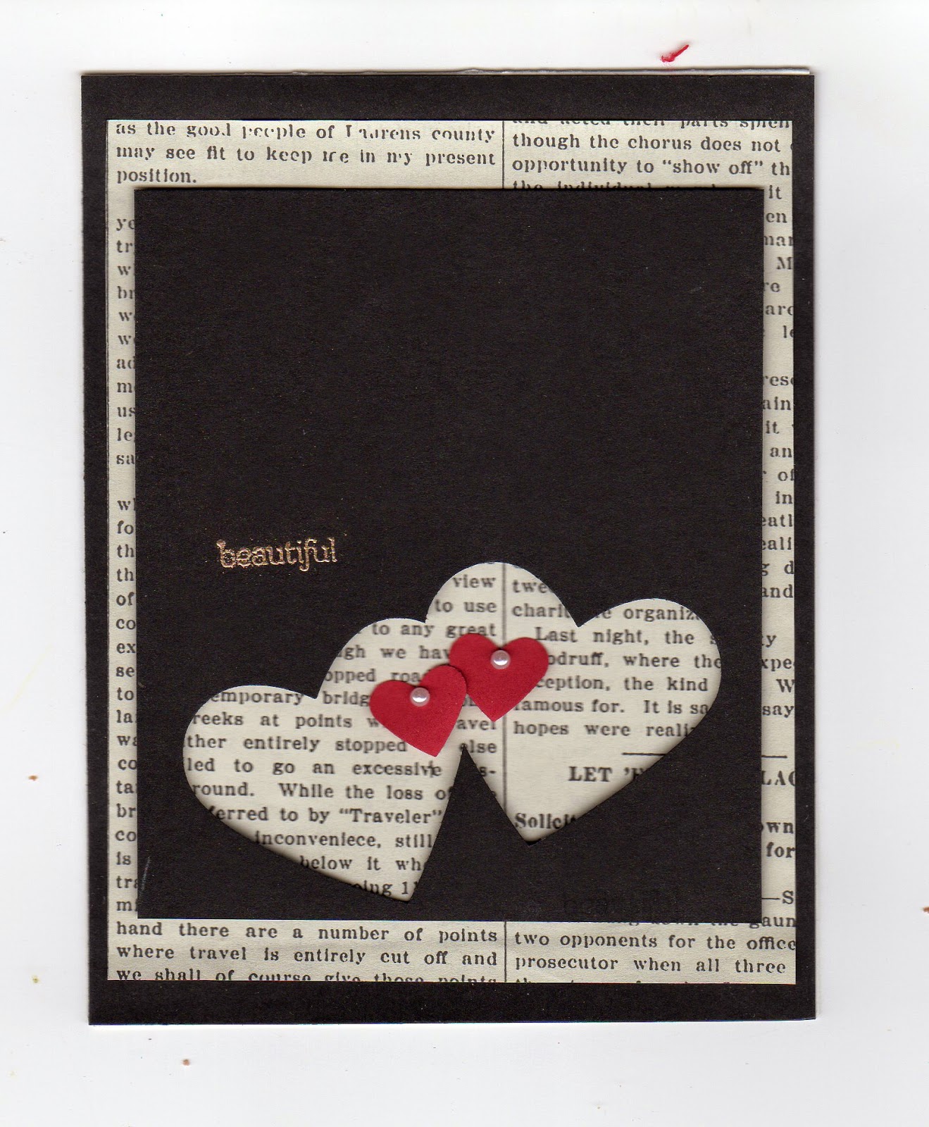
You could add ribbon or dress it up any other way you like. Even change up the colors and punch a different shape altogether! The sky's the limit!
{effortless} negative space snowman

Several friends who have young (ish) daughters have requested instructions for more basic cards. So I'm launching my {effortless} series. I don't have a schedule for when I'll post these since inspirations come to me at random times! But I'm interested in getting you off to a good start with some lovely do-able ideas.
This snowman card is one of the quickest, yet brilliant card schemes I found on Pinterest. (Don't ask me where; I searched and couldn't find it again. WHY didn't I pin it???) I don't think it looked exactly like this since I couldn't find it, but it's my version anyway!
Cut a piece of cardstock in half the long way so it measures 11 1/2" by 4 14". Score and fold it down the middle. This is the base of your card. Cut a piece of blue cardstock 4 1/4" by 5 1/2" and adhere it inside the card on the half where your greeting goes.
Now the fun begins! You may either stamp snowflakes on the front of your card or dry emboss a wintery image. In this case, I used Stampin' Up's Northern Flurries embossing folder.
Now get out your circle punch of whatever size you have. The size of your snowman depends on the size of your punch. Any size is cute! I used my 1 3/8" punch.
Punch out three part-circles on the front card flap, starting by punching about a 1/2 circle and punching smaller as you go up. Use a square punch to make his hat. I didn't have a punch for the hat brim so I just used a scissors to cut a skinny li'l brim.
Three pearls placed inside on the blue cardstock made up his buttons. DONE!!
Friday, 23 January 2015
the challenge spark---using negative spaces (beautiful butterfly)

The Challenge Spark is our way to get fresh new ideas circling in our creative spaces. Jane, Tara and I take turns coming up with something new every week. Tara is asking us to show her something using a northern lights technique next week. I'm gonna have to study up on that one a bit before I share it! Hopefully I can take a teeny break from my pet butterflies for a few seconds soon!
Saturday, 17 January 2015
mystic moonlit garden


When I get my new stamps into the house, I often spend hours dreaming of what kind of scenes I could create with each one. You guessed it! I love making a scene!!!
And ever since first spying this Butterfly Basics Bundle from the New Occasion Catalog, it's been begging to be made into a fairy-like moonlit garden scene. It reminded me of the place we lived at in Manitoba, years ago. Especially the shade garden on the east end of the house. I wanted to replicate it. (All I need yet is lilies of the valley!)
The white flowers and ferns are embossed in clear onto Whisper White cardstock and then I sponged Night of Navy, Not Quite Navy, and Marina Mist over it all, making sure to leave an area white for the moon rays. I sponged the darkest colors at the edge. Using these same colors, I stamped those two same images over the white embossing, giving it a 3-d effect. And then I die-cut the butterflies out of velum and different shades of blue cardstock, and layered it on with pearls to finish. I realize that the flowers are probably meant to be upright, but to me they look kinda like morning glory vines. That's what I love about Stampin' Up. So much can be done with one image or product. There is no right or wrong. Truly versatile.
I made several of these cards to send along with the catalogs to some of my friends. It seems surely everyone is gonna love these bundles as well as I do! They're keepers!
Wednesday, 14 January 2015
The Challenge Spark---vintage emboss resist (card #2 old nautical maps)

I wonder what the rest of you think of when you consider the word "vintage"? I think of colors (brown, black, gold, copper, really anything earthy and dusty with faded teals, greens and oranges thrown in. Maybe some red.). I think of genteel high-quality artifacts of past eras. After all, it would have to be high quality to survive the passing of time. I think of art. Hand-drawn, hand-painted, hand-built. All with fairly primitive tools and trades, yet highly skilled.
Like maps. Like ships. (Titanic, anyone?)
First I embossed in black the ship from Stampin' Up's Traveler. Then I punched out a circle from a scrap paper and placed it over the ship so that when I stamped the World Map over, it left the ship image clean and open. I embossed the map in black as well. Then all that was left was to sponge on the ink wherever and however it decided to go onto the map! This is one card that if I made a hundred, each would look different from the last!
Truly hand-made. Truly vintage!
Hop over to White Orchid to see what Jane's been up to! She's got a gorgeous butterfly card just WAITING for you to groove over!
The Challenge Spark---vintage emboss resist (hope is the thing with feathers)


This week for The Challenge Spark I requested the vintage emboss resist technique. Jane over on The White Orchid and I have started challenging each other every week to come up with a card or cards, as the case may be. We take turns choosing what the week's challenge will be. Next week, Jane is asking for a card using negative space. Like instead of using the heart you punched out, use the paper that you punched the heart out of. That's gonna be a fun one. Jane does all sorts like this!! And they're neat!
A bit about this Hope card (above). Ever since my recent Lupus diagnosis, the word "hope" has been floating around my brain, a little like these feathers. I love Emily Dickinson's poem, "Hope is the thing with feathers that perches in the soul..." Fortunately, Stampin' Up currently has these Four Feathers stamps and dies in the catalogue. Couldn't have come at a better time!
How I did it...I stamped and embossed the feathers and Everything Eleanor flourish in clear on Very Vanilla cardstock. Then using my ever faithful brayer, I brayered Basic Gray, Dusty Dorango, Hello Honey, Soft Suede and Early Espresso inks over the embossed images. I stamped a few more flourishes in Espresso over to give it a little oomph! And then...I searched all my stamps for the word "hope". Nada. So a quick stop at Walmart fixed the problem. With the help of INKADINKADOO's spring-like stamp set, I solved it. "Hope" is embossed in gold on velum.
For the inside of the card, I simply printed the first stanza of Emily Dickinson's poem with my computer and adhered it inside on a Basic Gray mat.
I think I might keep this card as it speaks hope to my heart these days.
Sunday, 11 January 2015
watercolor pressed roses

fairy skies (Challenge Spark---Bokeh Technique card #5)

Pure magic!
sunset sympathy (Challenge Spark---Bokeh Technique card #4)
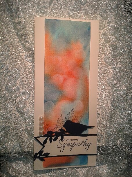
(I know I'm cheating...taking a short cut! Go ahead! Say it!)
northern lights love (Challenge Spark---Bokeh Technique)

(Blame my boys for the name! They thought it looked like our northern lights we see from our big living room window!)
fly into the sunset...for Kayla (Challenge Spark...Bokeh technique)

And ADDICTING!
And now I have a delicious wedding card to send to my friend, Kayla, for her wedding!
(Happy wedding, Kayla!!)
Saturday, 10 January 2015
wren in my garden (revised)

I stamped and colored the wren and plants from An Open Heart stamp set with Stampin' Write markers and then using a Versamark pen and clear embossing powder, embossed the images. After that I stamped my favorite Hardwood background and then added a few little finishing touches such as those banners, ribbon and feathers with pearls and it was done.
Birds make me so happy. You, too?
Thursday, 8 January 2015
Meet "The Challenge Spark"! Week 1...Bokeh Technique (revised)

We called it the "Spark" because it's from the teeniest sparks that the best inspirations burst! And while we each come up with our own idea sparks quite often, it's nice to have someone else spark that challenge and help us pull out inspirations we maybe didn't know we had stored inside us!
For this first week, Jane challenges us to do the Bokeh technique in any way we like. I hadn't even heard of Bokeh (where have I been??!!) but upon doing a Pinterest search...well, WOW!! There's lots out there!
The card above is my entry for this week. Sorry about the lighting...I had difficulty getting a clear pic on this one. (Advice welcome!) I love the simplicity of this technique. Yet how stunning the results! Come on, crack out the ink pads and daubers with us! We'd love to see what you come up with! It's easy! Punch out several different sizes of circles in a scrap paper and then use those empty circles as masks and sponge circles wherever you want them on your card face. Overlap them, stagger them, use different colors or all one color. It's gonna be gorgeous, whatever you do! I advise you to ink the circles heavier on one side. Looks more 3-d then. (And now that it's finished, it almost seems more in keeping with a masking technique...more on the Bokah coming!)
Next week, my challenge is to create a "Vintage Emboss Resist" card. Keep watching for those beauties!
Why not enter your email address at "follow by email" (lower, right) and you'll get these Spark posts as soon as we hit "publish".
Wednesday, 7 January 2015
newsprint friendship


This envelope was simply designed from Typeset Specialty Designer Paper, using the envelope punch board. Both items, you will see to the right, are on this week's sale list. Grab them today!
The card is simply a bunch of differently sized layers of paper. I couldn't help myself; I had to use that retired script embossing folder for the main brown piece. Any other design would work well.
four feathers in a fan

Here I first die cut my natural white cardstock with the hexagon hive die. And then...the fun part! I brayered different greens and blues over it in a diagonal pattern, blending all.
Those feathers were stamped and embossed using pool party and clear embossing powder. A bit of twine and a few li'l flowers stamped and punched finished the job.
Now, tell me what occasion you'd use this card for?
boys will be boys

A favorite tool of mine, the Stampin' Distress Tool, made those rugged edges on the blue core'dinatons paper (retired). Then a few random layered geometric shapes and rhinestones. Done!
Tuesday, 6 January 2015
SU sale outburst!!! Hear ye! Hear ye!
Look no farther than here to see the new Stampin' Up OCCASIONS spring and Easter catalogue! Wow! I'm loving so much of it!
And! For every $60 you spend before shipping and taxes you get a free item from this saleabration catalogue. This sale is from today until March 30th.
My favorite part of this year's saleabration and freebie list is that you can include the Blendabilities as your free items for every $60 purchase from the annual catty or this new Occasions one! How lovely is that?
Book your party today and you, the hostess, will receive wonderfully awesome benefits and discounts on Stampin' Up products. You're welcome to host an in-home party or if you're more comfortable grabbing a couple catalogues from me, getting a qualifying order yourself or among friends, let me know and I'll help you out with that as well.
(For my local friends, I'm popping in an order in the next day or two and you are welcome to add onto it!)
And once my product is in, I plan to show you myriad ways to use these wonderful toys!
Saturday, 3 January 2015
pleasant poppies


This card was done the same way as this butterfly only using different colors. All you do is emboss an image with clear embossing powder on vanilla paper. Then sponge or dab ink directly onto the image. The embossed area won't get inked up at all! Before I had sponge daubers or anything of that sort, I sometimes used cotton balls. Worked very well.
The thing I like about these type of cards is that they are so very quick and easy.
a quick note on comments...
Some of you ask why your comments aren't being published? They are. But only after they've come back to me and I hit "publish". This site is open to the whole wide world so I do feel this way is best for now. If you have more questions on this, feel free to ask!
(I WILL try and get your comments published as quick as I can after I receive them!)
(I WILL try and get your comments published as quick as I can after I receive them!)
Friday, 2 January 2015
the great outdoors...hot dogs roastin'


This card was stamped from Stampin' Up's "The Great Outdoors" set and then embossed in gold. Simple. And I added no embellishments since I run into extra postage issues when I do that and I'm hoping to mail this card.
The envelope...Post Card, Choose Happiness, The Great Outdoors stamp sets. Don't you love those naughty li'l ants creeping across the bottom?
thanks...for everything

HOWEVER, I DID use Stampin' Up's Stampin' Write markers and other SU inks to color the image!
Thursday, 1 January 2015
happy watercolor


What I was trying here, was a bit of an experiment to see if I could use Stampin' Blendabilities differently than they are designed for. They come in a package of three different shades of one color per package. And I think they are meant to use like that, as sets. Well, to me that's a little stifling and claustrophobic so I tried both ways and found I loved the second much MUCH better than the first. I used only calypso coral on the top card, while the bottom one I used the medium shade of cherry cobbler and the lightest of calypso coral. And THEN, I lightened both of them up with the color lifter. Then I embossed those gorgeous poppies twice with clear embossing powder.
The only thing left was a little masking and shading (and background stamping on the last card) and they were mostly finished.
If I were to vote, I'd say the second one turned out much better than the first. And, when you decide to order those markers from Stampin' Up, please order that color lifter as well. It MAKES the card, don't you think?!
blissful butterfly---Swallowtail


Stampin' Up weekly deals
Beginning every Tuesday, Stampin' Up puts approximately 8 or so items on sale. Click here to see what kinda good deals you can get this week and if there's anything I can order for you contact me and I'll get them for you.
Stampin' Up's clearing out for the New Year!
Check out this link for Stampin' Up's year-end clearout sale
These items will go fast so contact me for any items you'd like to order while quantities last!
These items will go fast so contact me for any items you'd like to order while quantities last!
Coffee...total complete bliss

I must admit that between Michelle Zindorf's tutorials and coffee and my favorite hand-made paper from India, I can hardly fathom a better combination! Here is Michelle's card that I copied.
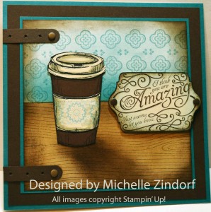
Of course, Michelle does a much better job than I do, but hey! I had fun with it!
Since this card is from waaaay back, my wood grain background stamp is from IMPRESSION OBSESSION, but I have since then replaced it with Stampin' Up's "Hardwood". I believe all the other stamps and ink are from Stampin' Up. But most of the paper is from friends in India.
Subscribe to:
Posts
(
Atom
)